
What mobile-first indexing means for high-risk e-commerce businesses
As July has come and gone, there’s been some big SEO news that’s critical for all e-commerce sites. In July, we covered the absolute need for SSL and HTTPS for high-risk e-commerce sites. New changes include some broad ranking update rollouts and the Mobile Speed ranking factor, but we won’t be focusing our attention on it this month. Instead, we’ll look at what the mobile-first Indexing move means for high-risk e-commerce sites. After all, ranking well is especially important for high-risk business types, as many traditional marketing avenues are less easily available.
There are many questions surrounding what this new indexing procedure means for all manner of websites. We’ll do our best to help you get a firmer grip on the new SEO landscape. We’ll do this by going through some common misconceptions, some practical tips, and what all of this will mean for your high-risk business.
What the mobile-first indexing actually is
As we mentioned, there’s been some confusion as to what mobile-first indexing entails, not to mention what it means for online businesses. In effect, mobile-first indexing is a major shift in Google’s priorities, changing the emphasis from desktop to mobile. It essentially says that Google bots, when crawling and caching your website, will first and foremost be looking for the mobile version of your site.
For instance, if you have a specific URL-domain for your mobile site (i.e., m.yourwebsite’s URL), known as an m-dot site), then Google will cache and prioritize this page first. The emphasis here is on first. Google will not abandon or chastise your site if it doesn’t have what is known as an m-dot iteration. However, it will look for a mobile-friendly version of your site first. In other words, it isn’t directly harmful to not have a mobile-friendly site, but it certainly won’t do you any favors.
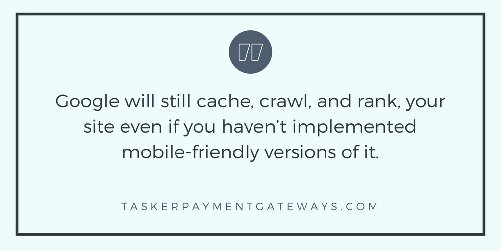
Google will still cache, crawl, and rank, your site even if you haven’t implemented mobile-friendly versions of it. However, Google is and has been for many years now, moving towards rewarding sites that cater to mobile users. Additionally, users are increasingly taking to mobile devices and platforms for all their consumer needs. In summary, we highly recommend that you embrace this change rather than fight it.
Do you have to make your high-risk site mobile friendly?
It’s not necessary just yet to create a mobile version of your site if you don’t have one. However, these recent shifts in Google’s priorities mean that it will be very soon. Google’s index is now actively looking for mobile-friendly sites first. This means that it will also boost the ranking of sites that cater to mobile visitors. If we want to see some of the different ranking elements that come with this, you’ll find there’s an overwhelming amount of factors that can be negatively affected by failing to cater to a mobile audience.
- Content
- Mobile Speed
- RankBrain (RB)
- Click Through Rates (CTR)
- Bounce Rates (BR)
- User Experience (UX)
- Conversion Rates (CR)
Add all of this up, and you’ll find that your website will suffer by failing to do something to help, and provide value to, your mobile audience. Don’t worry if you’re unfamiliar with the items on this list – we have you covered! Below you’ll find a more in-depth explanation as to how all of this fits together.
Explaining the ranking signals that will affect your site
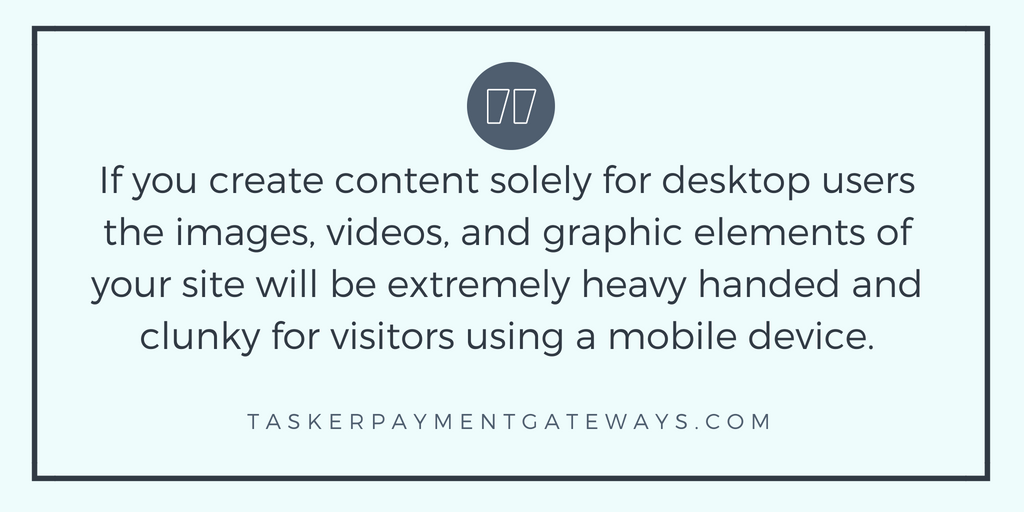
If you create content solely for desktop users the images, videos, and graphic elements of your site will be extremely heavy handed and clunky for visitors using a mobile device. This can lead those visiting your high-risk e-commerce site to believe that it’s outdated and unreliable. In effect, it will severely compromise the user experience. In turn, this will have negative bearings on both your bounce rates and conversion rates. You should keep the mobile user journey in mind when it comes to the design, coding, and content of your website.
Mobile conversion rates and bounce rates
Even if you don’t believe that you’ll land sales on a mobile platform, or you historically rarely do, the fact is that a lot of pre-purchase research is done via mobile devices. Regardless of whether you have a storefront with an accompanying website, or if you’re solely an e-commerce business, people are more likely to do research before committing to a purchase. Let’s run with an example. Someone tries to find a site that sells vape products online and visits your site on a mobile device while out and about. Unfortunately, they have a negative experience. As a consequence, they are highly unlikely to go back to your site to complete a purchase later on.
A more immediate effect you might notice is that the bounce rate of your site on mobile devices goes up. This is a ranking signal in and of itself and will have a certain and negative impact on your site.
What to expect from Mobile Speed and RankBrain
It goes without saying that you are not optimizing for Mobile Speed if you’re not taking any action to make your site mobile friendly. If you’re curious as to how fast your site is on a mobile device, check this simple and free Google Mobile Speed test.
Additionally, RankBrain will take this user behavior into account when arranging and calculating the value your site provides to certain queries.
While many webmasters have proclaimed recent moves by Google towards mobile indexing as “Mobilegeddon,” it’s not all that terrible. The fact remains that you don’t have to make your site mobile friendly. Keep in mind, there is a simple and free Google Mobile Speed test as well. However, the benefits of having a mobile friendly site are clear for all to see. If you’re looking to take action to help your high-risk web-store, we want to give you some pointers below.
How your high-risk business can deal with mobile-first indexing
We found some very useful information that hits the nail on the head as to whether or not you need to take action ASAP. The screenshot below is from “Best practices for mobile-first indexing, Search, Google Developers,” which is why you’ll find an attribution paragraph at the end of this page in accordance with Google Devs’ terms and policies.
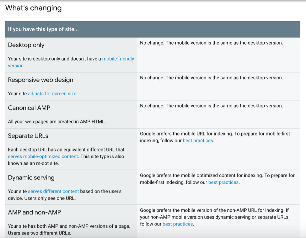
From the screenshot above we can see that Google states that the crawling of your site is not impacted if your site is a) Desktop only b) Responsive Web Design or c) Canonical AMP. In other words, if your FFL e-commerce site is solely set up for desktop, you technically do not need to make any considerable changes. However, you should bear in mind what we mentioned above about the negative aspects of not having a mobile-friendly site.
New best practice tips for high-risk sites
On the other hand, if your site type is a) Separate URLs b) Dynamic serving or c) AMP and non-AMP, the introduction of mobile-first indexing will need some structural best practice changes.
- Make sure you serve content on the mobile site that is equivalent to the desktop site. This is not to say that both versions need to be identical. However, it should be more or less the same on all devices. We all know that the format and stylistic elements should be different on mobile and desktop versions. The main point is that both versions should contain the same information.
- Ensure that both mobile and desktop versions of your site have structured data. While you should add structured data to both versions, make sure you don’t add it redundantly. Additionally, make sure that the structured data for your mobile site refers to mobile URLs, and vice versa.
- Metadata must be present and equivalent on both versions of your site. This might seem obvious, but it’s something that can easily be missed. The big thing here is to ensure that your metadata is equivalent. There’s a considerable difference in available pixel real-estate on mobile devices in contrast to what’s available on desktop screens. Shorten your metadata effectively, while keeping the information as similar as possible.
There are plenty of other things you can and should do to improve the overall readiness of your site. You should do this to cater for both mobile-first indexing and mobile visitors.
Prepare your high-risk e-commerce site for mobile-first indexing
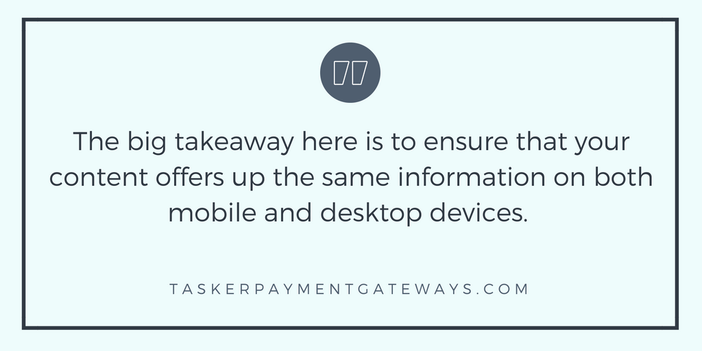
The big takeaway here is to ensure that your content offers up the same information on both mobile and desktop devices. We highly recommend that you use responsive designs for your website and visual/audio content. If you do have an m-dot site, remember to keep structural data strictly mobile for the mobile version of your site. When it comes to metadata – keep it short, sweet, and to the point.
“Portions of this page are reproduced from work created and shared by Google and used according to terms described in the Creative Commons 3.0 Attribution License.”